Brand Logo

-
Its Inclusive
MeaningsNEWLIFE Group (China) Co., Ltd. creates health and beauty, spreads hope and vitality, and continues moving forward to the international fields.
-
Letters
English font that expresses strong energy to make the sunlight and vitality of NEWLIFE stand out.
-
Composition
of the LogoIt discloses a representative image that shows bold and deep meanings through a perfect combination of a flower and English letters compared to the previous logo. An image of white, full-petaled Shasta daisy emphasizes the spread of the beautiful and happy business as it implies a clean and honest vision of our company, and choosing the bold font indicates the power and vitality of the NEWLIFE Group.
-
Colors
Supplemented colors of pure and hopeful bright green stand for the clean and honest vision of our company.
-
Flower
Means purity, vitality, and love.
Logo Colors
Colors of
the Logo
The standard colors of the logo play a part in visually perceiving the colors, and these are the major elements of symbolizing the entrepreneurialism and the cultural vision of our company.
This manual gives a strong impression to people by visually conveying the high brightness of the various colors, and it suits well with the NEWLIFE's vision as it represents the fullness and openness that NEWLIFE Group carries.
This manual includes the standard color values for these to ensure consistency of the used colors.
Colors of
the Logo
To ensure there are ample changes as well as the image combination of the NEWLIFE logo, the company needs to support more display and promotion of the image.
In this manual, a logo using secondary colors is made so that it can adjust to the standard colors and apply for designing the logo.
To meet various scenes, environments, craft materials, sizes, cultural demands and special backgrounds, and special requests, the basic secondary colors of the logos may consist of black, white, grey, gold, and silver to create an uneven effect.
Standardization Rules on the Supplementary Graph
-

-
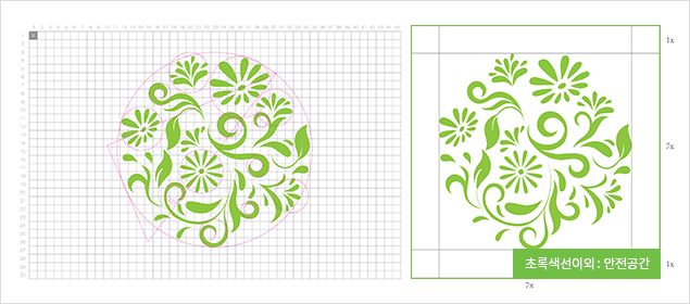
Standardized Construction and Safe Area of the Supplementary Graph
The supplementary graph effectively assists the application of a visual system and function as an important element of the brand's basic visual elements. NEWLIFE logo implements its pure and honest vision at the same it strongly appeals to the mind portrayed in the logo itself, which attracts the attention of the customers to arouse their curiosity with its vivid visual features of the flower used in a supplementary graph.
-
Standardized Construction and Safe Area of the Supplementary Graph
-

-
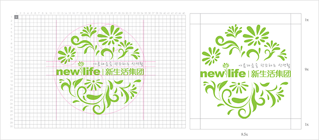
Standardized Construction and Safe Area of the Combined Supplementary Graph and Logo
The combination of the supplementary graph and logo creates a solid sequence and rhythm, increases visual rhythm, and gives strong visual shock and aesthetic sense to the customers to make visual appeal and familiarity as well as increasing the interest to the aesthetic and design minds.
-
Standardized Construction and Safe Area of the Combined Supplementary Graph and Logo


